Scaffold class in Flutter with Examples
Drawer, Snack Bar, Bottom-Navigation Bar, Floating Action Button, App-Bar, and many more are provided by the Scaffold class in a flutter. The scaffold will grow to fill the entire screen of the device. Vacant space will be filled by it. Authentication flow using flutter and firebase the application’s fundamental material design layout can be implemented with the help of the scaffold.
What is the Scaffold class in Flutter?
The flutter forums widget Scaffold helps implement the fundamental visual layout structure of the material design. It has nearly all the features necessary to build responsive Flutter apps and is fast enough to build general-purpose mobile applications. If this widget wants to, it can take up the entire smartphone screen.
The main widget creates the program’s screen basis, which the child widgets use to display their content. In addition to many other widgets and APIs, it includes support for displaying a Floating Action Button, Bottom Navigation Bar, App Bar, Snack Bar, and Drawer. Here is an example of Scaffold class in Flutter:
import 'package:flutter/material.dart';
void main() => runApp(MyApp());
class MyApp extends StatelessWidget {
@override
Widget build(BuildContext context) {
return MaterialApp(
title: 'Flutter Scaffold Example',
theme: ThemeData(
primarySwatch: Colors.blue,
),
home: MyHomePage(),
);
}
}
class MyHomePage extends StatelessWidget {
@override
Widget build(BuildContext context) {
return Scaffold(
appBar: AppBar(
title: Text('Scaffold Example'),
),
body: Center(
child: Text('Hello, world!'),
),
floatingActionButton: FloatingActionButton(
onPressed: () {
// Action to perform when button is pressed
},
child: Icon(Icons.add),
),
bottomNavigationBar: BottomNavigationBar(
items: [
BottomNavigationBarItem(
icon: Icon(Icons.home),
label: 'Home',
),
BottomNavigationBarItem(
icon: Icon(Icons.search),
label: 'Search',
),
],
),
drawer: Drawer(
child: ListView(
padding: EdgeInsets.zero,
children: <Widget>[
DrawerHeader(
child: Text('Drawer Header'),
decoration: BoxDecoration(
color: Colors.blue,
),
),
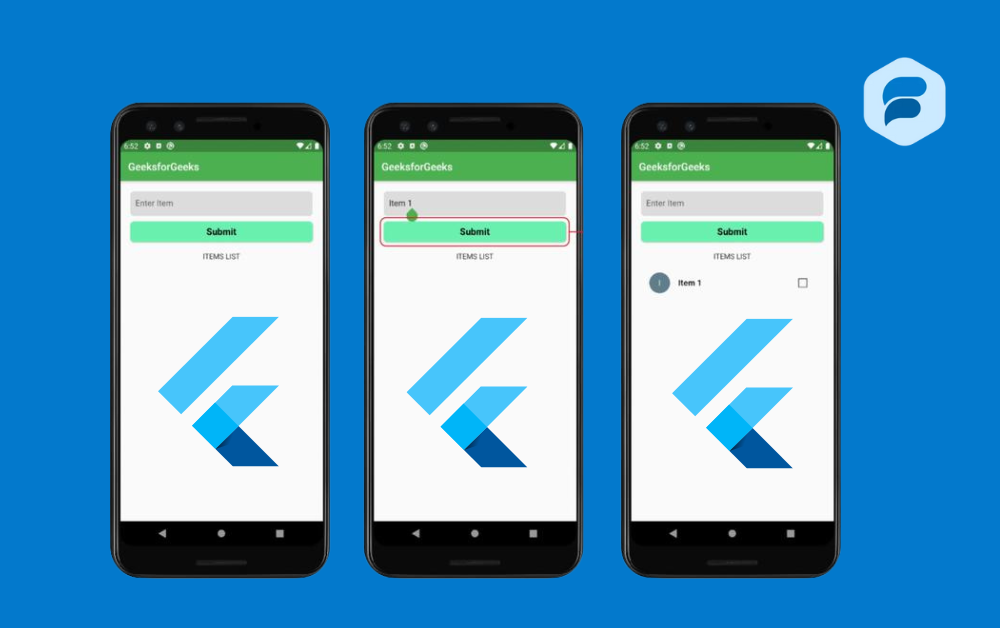
ListTile(
title: Text('Item 1'),
onTap: () {
// Update the state of the app
// ...
Navigator.pop(context);
},
),
ListTile(
title: Text('Item 2'),
onTap: () {
// Update the state of the app
// ...
Navigator.pop(context);
},
),
],
),
),
snackbar: SnackBar(
content: Text('This is a snackbar!'),
),
);
}
}Using the Scaffold class in flutter, we can quickly establish the style and design of our app without having to construct each visual element by hand. This reduces the effort required to code the software’s aesthetic aspects. The Scaffold widget class’s constructor and properties are here.
Properties of Scaffold class
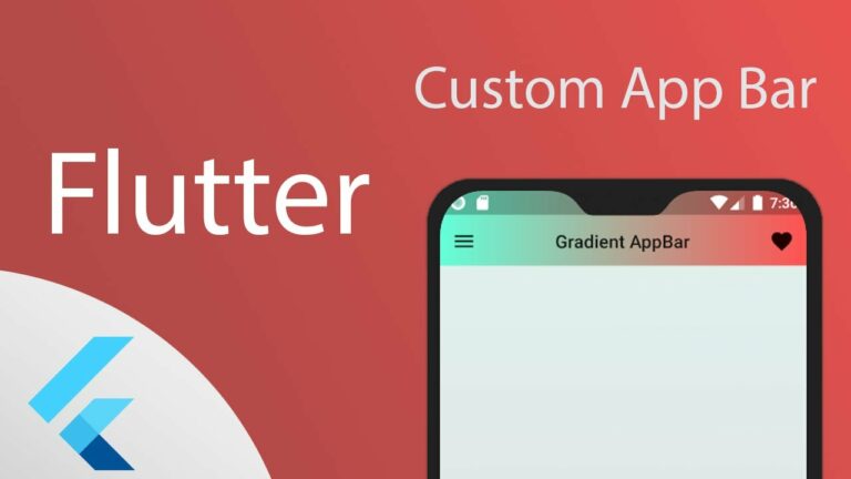
App-Bar: A horizontal bar, mainly located at the Scaffold’s top, is shown. The AppBar widget appBar uses has its attributes, such as height, title, brightness, and so on.
Example:
import 'package:flutter/material.dart';

void main() => runApp(MyApp());

class MyApp extends StatelessWidget {

  @override

  Widget build(BuildContext context) {

    return MaterialApp(

      title: 'Flutter AppBar Example',

      theme: ThemeData(

        primarySwatch: Colors.blue,

      ),

      home: MyHomePage(),

    );

  }

}

class MyHomePage extends StatelessWidget {

  @override

  Widget build(BuildContext context) {

    return Scaffold(

      appBar: AppBar(

        title: Text('AppBar Example'),

        centerTitle: true,

        brightness: Brightness.dark, // Deprecated, use systemOverlayStyle instead

        systemOverlayStyle: SystemUiOverlayStyle.light, // New way to set brightness

        backgroundColor: Colors.blueAccent,

        elevation: 4.0,

        leading: IconButton(

          icon: Icon(Icons.menu),

          onPressed: () {

            // Action to perform when menu button is pressed

          },

        ),

        actions: <Widget>[

          IconButton(

            icon: Icon(Icons.search),

            onPressed: () {

              // Action to perform when search button is pressed

            },

          ),

          IconButton(

            icon: Icon(Icons.more_vert),

            onPressed: () {

              // Action to perform when more button is pressed

            },

          ),

        ],

      ),

      body: Center(

        child: Text('Hello, world!'),

      ),

    );

  }

}body: The core or main content of the Scaffold will be shown. It is located below the appBar. By default, the widgets inside the body are displayed in the left-hand corner.
Example:
import 'package:flutter/material.dart';

void main() => runApp(MyApp());

class MyApp extends StatelessWidget {

  @override

  Widget build(BuildContext context) {

    return MaterialApp(

      title: 'Flutter Scaffold Body Example',

      theme: ThemeData(

        primarySwatch: Colors.blue,

      ),

      home: MyHomePage(),

    );

  }

}

class MyHomePage extends StatelessWidget {

  @override

  Widget build(BuildContext context) {

    return Scaffold(

      appBar: AppBar(

        title: Text('Scaffold Body Example'),

      ),

      body: Center(

        child: Column(

          mainAxisAlignment: MainAxisAlignment.center,

          children: <Widget>[

            Text(

              'Hello, world!',

              style: TextStyle(fontSize: 24),

            ),

            SizedBox(height: 20),

            ElevatedButton(

              onPressed: () {

                // Action to perform when button is pressed

              },

              child: Text('Press Me'),

            ),

          ],

        ),

      ),

    );

  }

}
floatingActionButton: The floating action button is typically located in the bottom right corner. A floating action button is an icon button that stays put over the screen’s content. Its location will remain fixed regardless of how often we scroll the page.
Example:
import 'package:flutter/material.dart';

void main() => runApp(MyApp());

class MyApp extends StatelessWidget {

  @override

  Widget build(BuildContext context) {

    return MaterialApp(

      title: 'Flutter FloatingActionButton Example',

      theme: ThemeData(

        primarySwatch: Colors.blue,

      ),

      home: MyHomePage(),

    );

  }

}

class MyHomePage extends StatelessWidget {

  @override

  Widget build(BuildContext context) {

    return Scaffold(

      appBar: AppBar(

        title: Text('FloatingActionButton Example'),

      ),

      body: Center(

        child: Text(

          'Hello, world!',

          style: TextStyle(fontSize: 24),

        ),

      ),

      floatingActionButton: FloatingActionButton(

        onPressed: () {

          // Action to perform when button is pressed

          ScaffoldMessenger.of(context).showSnackBar(

            SnackBar(

              content: Text('FAB Pressed!'),

            ),

          );

        },

        child: Icon(Icons.add),

        tooltip: 'Add',

      ),

      floatingActionButtonLocation: FloatingActionButtonLocation.endFloat,

    );

  }

}
The floatingActionButton property in the Scaffold widget makes adding floating action buttons (FABs) to your app accessible. Clear action is taken when users click this button, which stays in place over the screen’s content and is generally in the bottom right corner. Most of the time, the FAB has an icon that, when pressed, does something
- Background-Color: Scaffold class utilized for changing the color of the entire Scaffold widget.
- Floating Action Button Animator: used to make the floating action button move with animation.
- Paramount Importance: To determine the display status of the Scaffold class.
- DrawerScrimColor: utilized to specify the hue of the main contents when a drawer is open.
- Drawer: The drawer can take the form of a panel or slider menu that sits on the scaffold’s side. To access the drawer menu, the user must swipe from left to right or right to left, depending on the action that has been defined. An appropriate drawer icon is automatically put at a specified position in the Appbar. Furthermore, Scaffold class the motion to open the drawer is pre-programmed. The Scaffold is in charge of that.
- Bottom Navigation Bar: The Bottom Navigation Bar, a Scaffold class resembling a menu, is located at the base of the Scaffold. This navigation bar is present in the majority of applications. In the bar, we have the option to put various icons, messages, or a combination of the two.
- Bottom sheet: The widget (final) object is the one this property accepts as an argument for its bottom-screen display.
- Drawer Drag Start Behavior: To set the drawer’s drag behavior, this property takes the DragStartBehavior enum as an object.
- Drawer Edge Drag Width: This establishes the threshold below which the drawer will open in response to a drag or swipe. The scaffold class additionally, accepts a duplicate as its target.
- Drawer Enable Open Gesture: By default scaffold class, this property is set to true, but it may be changed to any value you choose. It determines whether the drawer will open with a drag gesture or not.
- End Drawer: A widget can be passed as an argument to the endDrawer property. Like the Drawer, but with the reverse way of opening.
- End Drawer Enable Open Gesture: Once again, this property accepts a boolean value as its object to indicate whether the enddrawer will be opened with the drag signal or not.
- Extend Body: The extended object that the body property accepts is a boolean value. This property should never be null, yet it is always false by default. The bottom navigation bar or persistentFooterButtons causes it to be set to true, which adds their height to the body and moves them underneath.
Extend Body Behind App Bar
A Mobile Application Using Flutter boolean is also an acceptable object type for this property. This property should never be null, yet it is always false by default. Instead of being on the body, the app bar is stretched over it, and its height is added to the body when it’s set to true. To make the app-Bar color semi-transparent, you can utilize this setting.
- Floating Action Button: You may thank this property for controlling where the floating Action Button appears.
- PersistentFooterButton: You can pass a list of widgets to this attribute, which are usually buttons that are presented underneath the scaffold.
Resize to Avoid Bottom Insets
An object with a Boolean value can be passed to this attribute. The scaffold’s floating widgets will resize themselves so they don’t block the on-screen keyboard if this property is set to true.
Conclusion
Now you have a basic understanding of Scaffold thanks to this primer on its many features. We aimed to familiarize you with various properties and their applications. The Flutter app’s material design’s fundamental visual layout structure can be implemented with a Scaffold Widget’s help. Drawers, snack bars, Scaffold class, and bottom sheets can be displayed through its APIs.