Flutter Expansion Tile Card
Hello friend, this post will discuss adding an expandable list tile in the Flutter Expansion Tile Card app. This technique resembles how we employ a List Tile in a List View. So, before we start, let’s decide what we wish to accomplish today.
What is an Expansion Tile Card?
The Flutter Expansion Tile Card functions like the standard expansion tile of the Flutter SDK. However, it raises a tile using Google’s approach in its products. Thus, it is a superior variation of Flutter’s Expansion TileCard.
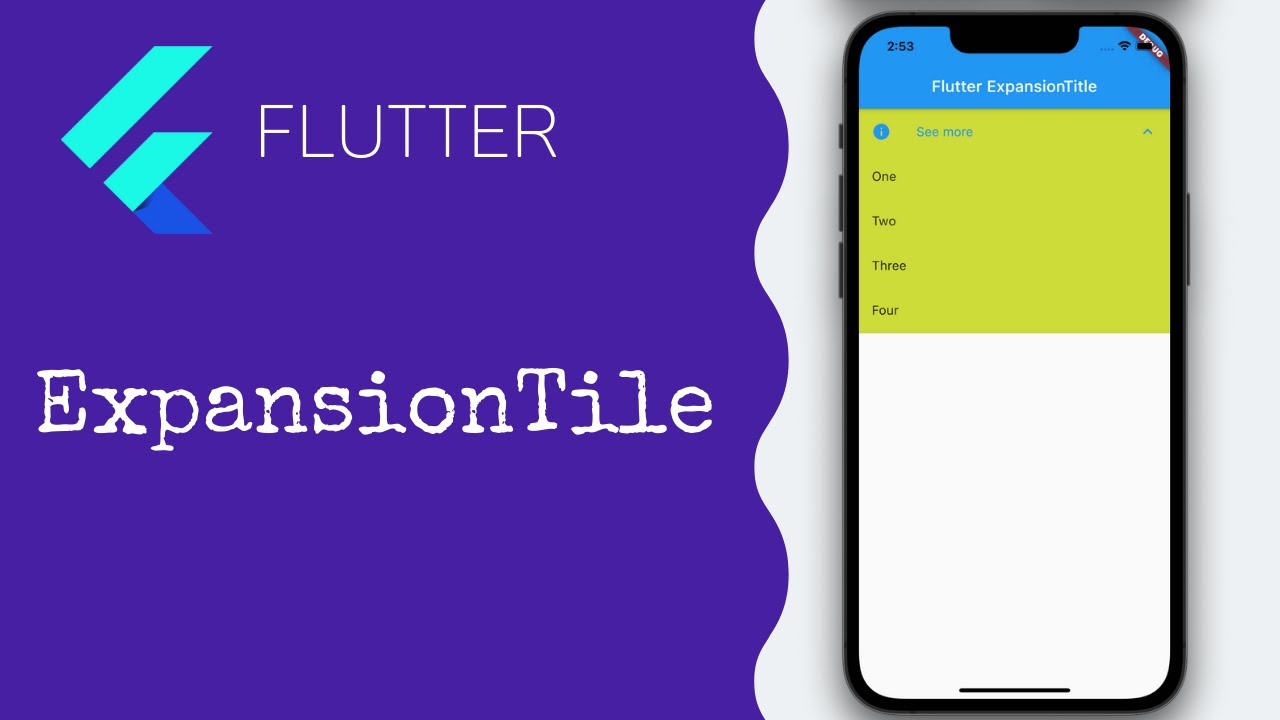
The only difference between an expansion tile in Flutter and the ListTile you might have already used in the list view is that the user may expand or collapse the tile to examine more tile specifics. The accompanying picture shows an expansion tile as an illustration.
The Flutter Expansion Tile Card is mainly used when you wish to include additional details to your List tile, but the details are not needed at first glance. The user can view this if they wish.
Building a ListView Expansion Tile Card
Let us first create a simple list view, including a list tile, before building an extended list view. We simply add a ListView.builder() inside the scaffold’s body to accomplish that.
Example
import 'package:flutter/material.dart';

void main() => runApp(MyApp());

class MyApp extends StatelessWidget {
  @override
  Widget build(BuildContext context) {
    return MaterialApp(
      home: SimpleListView(),
    );
  }
}

class SimpleListView extends StatelessWidget {
  @override
  Widget build(BuildContext context) {
    return Scaffold(
      appBar: AppBar(
        title: Text('Simple List View'),
      ),
      body: ListView.builder(
        itemCount: 10, // Number of items in the list
        itemBuilder: (context, index) {
          return ListTile(
            leading: Icon(Icons.person),
            title: Text('Item $index'),
            subtitle: Text('Subtitle $index'),
            trailing: Icon(Icons.arrow_forward),
            onTap: () {
              // Handle item tap
              print('Tapped on item $index');
            },
          );
        },
      ),
    );
  }
}
This code will make a simple list view with 10 list tiles. Each tile will show an icon, a title, a subtitle, and an icon at the end of the list.
Adding an expansion tile to a list
viewOur simple list view is now ready. To expand the list items, we only need to replace the ListTile widget with an ExpansionTile.example
example
import 'package:flutter/material.dart';

void main() => runApp(MyApp());

class MyApp extends StatelessWidget {
  @override
  Widget build(BuildContext context) {
    return MaterialApp(
      home: ExpandedListView(),
    );
  }
}

class ExpandedListView extends StatelessWidget {
  @override
  Widget build(BuildContext context) {
    return Scaffold(
      appBar: AppBar(
        title: Text('Expanded List View'),
      ),
      body: ListView.builder(
        itemCount: 10, // Number of items in the list
        itemBuilder: (context, index) {
          return ExpansionTile(
            leading: Icon(Icons.person),
            title: Text('Item $index'),
            subtitle: Text('Subtitle $index'),
            trailing: Icon(Icons.arrow_drop_down),
            children: <Widget>[
              ListTile(
                title: Text('Details for Item $index'),
                subtitle: Text('More information here...'),
              ),
            ],
          );
        },
      ),
    );
  }
}
With this code, a list view with 10 items will be made that can be expanded. You can open each item to see more information.
Change the ListTile to an Flutter Expansion Tile Card. If we click on the tile, it will grow and become underlined, and the arrow will point in a different direction.
example
import 'package:flutter/material.dart';

void main() => runApp(MyApp());

class MyApp extends StatelessWidget {
  @override
  Widget build(BuildContext context) {
    return MaterialApp(
      home: ExpandedListView(),
    );
  }
}

class ExpandedListView extends StatelessWidget {
  @override
  Widget build(BuildContext context) {
    return Scaffold(
      appBar: AppBar(
        title: Text('Expanded List View'),
      ),
      body: ListView.builder(
        itemCount: 10, // Number of items in the list
        itemBuilder: (context, index) {
          return CustomExpansionTile(
            leading: Icon(Icons.person),
            title: Text('Item $index'),
            subtitle: Text('Subtitle $index'),
            children: <Widget>[
              ListTile(
                title: Text('Details for Item $index'),
                subtitle: Text('More information here...'),
              ),
            ],
          );
        },
      ),
    );
  }
}

class CustomExpansionTile extends StatefulWidget {
  final Widget leading;
  final Widget title;
  final Widget subtitle;
  final List<Widget> children;

  CustomExpansionTile({this.leading, this.title, this.subtitle, this.children});

  @override
  _CustomExpansionTileState createState() => _CustomExpansionTileState();
}

class _CustomExpansionTileState extends State<CustomExpansionTile> {
  bool _isExpanded = false;

  @override
  Widget build(BuildContext context) {
    return Container(
      decoration: BoxDecoration(
        border: Border(
          bottom: BorderSide(
            color: _isExpanded ? Colors.blue : Colors.transparent,
            width: 2.0,
          ),
        ),
      ),
      child: ExpansionTile(
        leading: widget.leading,
        title: widget.title,
        subtitle: widget.subtitle,
        trailing: Icon(
          _isExpanded ? Icons.arrow_drop_up : Icons.arrow_drop_down,
        ),
        children: widget.children,
        onExpansionChanged: (bool expanded) {
          setState(() {
            _isExpanded = expanded;
          });
        },
      ),
    );
  }
}
When the tile is made bigger, we can’t see anything. This is because we need to tell ExpansionTile about the child option. When we make the tile bigger, the children will be shown whatever widget we give.
Example
import 'package:flutter/material.dart';

void main() => runApp(MyApp());

class MyApp extends StatelessWidget {
  @override
  Widget build(BuildContext context) {
    return MaterialApp(
      home: ExpandedListView(),
    );
  }
}

class ExpandedListView extends StatelessWidget {
  @override
  Widget build(BuildContext context) {
    return Scaffold(
      appBar: AppBar(
        title: Text('Expanded List View'),
      ),
      body: ListView.builder(
        itemCount: 10, // Number of items in the list
        itemBuilder: (context, index) {
          return CustomExpansionTile(
            leading: Icon(Icons.person),
            title: Text('Item $index'),
            subtitle: Text('Subtitle $index'),
            children: <Widget>[
              ListTile(
                title: Text('Details for Item $index'),
                subtitle: Text('More information here...'),
              ),
              ListTile(
                title: Text('Additional Detail 1'),
              ),
              ListTile(
                title: Text('Additional Detail 2'),
              ),
            ],
          );
        },
      ),
    );
  }
}

class CustomExpansionTile extends StatefulWidget {
  final Widget leading;
  final Widget title;
  final Widget subtitle;
  final List<Widget> children;

  CustomExpansionTile({this.leading, this.title, this.subtitle, this.children});

  @override
  _CustomExpansionTileState createState() => _CustomExpansionTileState();
}

class _CustomExpansionTileState extends State<CustomExpansionTile> {
  bool _isExpanded = false;

  @override
  Widget build(BuildContext context) {
    return Container(
      decoration: BoxDecoration(
        border: Border(
          bottom: BorderSide(
            color: _isExpanded ? Colors.blue : Colors.transparent,
            width: 2.0,
          ),
        ),
      ),
      child: ExpansionTile(
        leading: widget.leading,
        title: widget.title,
        subtitle: widget.subtitle,
        trailing: Icon(
          _isExpanded ? Icons.arrow_drop_up : Icons.arrow_drop_down,
        ),
        children: widget.children,
        onExpansionChanged: (bool expanded) {
          setState(() {
            _isExpanded = expanded;
          });
        },
      ),
    );
  }
}
We now have a list view with a child that can be expanded, which was our goal. But the expanded tile doesn’t look good. The Flutter Expansion Tile Card constructor has some other options that we can use to make the tile look better. Let’s look at each of them.
Properties of Expansion Tile Widget
import 'package:flutter/material.dart';

void main() => runApp(MyApp());

class MyApp extends StatelessWidget {
  @override
  Widget build(BuildContext context) {
    return MaterialApp(
      home: ExpandedListView(),
    );
  }
}

class ExpandedListView extends StatelessWidget {
  @override
  Widget build(BuildContext context) {
    return Scaffold(
      appBar: AppBar(
        title: Text('Enhanced Expanded List View'),
      ),
      body: ListView.builder(
        itemCount: 10, // Number of items in the list
        itemBuilder: (context, index) {
          return CustomExpansionTile(
            leading: Icon(Icons.person),
            title: Text('Item $index'),
            subtitle: Text('Subtitle $index'),
            initiallyExpanded: index == 0, // First item expanded initially
            maintainState: true,
            expandedCrossAxisAlignment: CrossAxisAlignment.start,
            expandedAlignment: Alignment.centerLeft,
            childrenPadding: EdgeInsets.all(16.0),
            backgroundColor: Colors.grey[200],
            collapsedBackgroundColor: Colors.white,
            textColor: Colors.black,
            collapsedTextColor: Colors.grey,
            iconColor: Colors.black,
            collapsedIconColor: Colors.grey,
            shape: RoundedRectangleBorder(
              borderRadius: BorderRadius.circular(15.0),
            ),
            children: <Widget>[
              ListTile(
                title: Text('Details for Item $index'),
                subtitle: Text('More information here...'),
              ),
              ListTile(
                title: Text('Additional Detail 1'),
              ),
              ListTile(
                title: Text('Additional Detail 2'),
              ),
            ],
          );
        },
      ),
    );
  }
}

class CustomExpansionTile extends StatefulWidget {
  final Widget leading;
  final Widget title;
  final Widget subtitle;
  final List<Widget> children;
  final bool initiallyExpanded;
  final bool maintainState;
  final CrossAxisAlignment expandedCrossAxisAlignment;
  final Alignment expandedAlignment;
  final EdgeInsetsGeometry childrenPadding;
  final Color backgroundColor;
  final Color collapsedBackgroundColor;
  final Color textColor;
  final Color collapsedTextColor;
  final Color iconColor;
  final Color collapsedIconColor;
  final ShapeBorder shape;

  CustomExpansionTile({
    this.leading,
    this.title,
    this.subtitle,
    this.children,
    this.initiallyExpanded = false,
    this.maintainState = false,
    this.expandedCrossAxisAlignment = CrossAxisAlignment.center,
    this.expandedAlignment = Alignment.center,
    this.childrenPadding = EdgeInsets.zero,
    this.backgroundColor,
    this.collapsedBackgroundColor,
    this.textColor,
    this.collapsedTextColor,
    this.iconColor,
    this.collapsedIconColor,
    this.shape,
  });

  @override
  _CustomExpansionTileState createState() => _CustomExpansionTileState();
}

class _CustomExpansionTileState extends State<CustomExpansionTile> {
  bool _isExpanded = false;

  @override
  void initState() {
    super.initState();
    _isExpanded = widget.initiallyExpanded;
  }

  @override
  Widget build(BuildContext context) {
    return Container(
      decoration: BoxDecoration(
        border: Border(
          bottom: BorderSide(
            color: _isExpanded ? Colors.blue : Colors.transparent,
            width: 2.0,
          ),
        ),
        color: _isExpanded ? widget.backgroundColor : widget.collapsedBackgroundColor,
      ),
      child: ExpansionTile(
        leading: widget.leading,
        title: DefaultTextStyle(
          style: TextStyle(color: _isExpanded ? widget.textColor : widget.collapsedTextColor),
          child: widget.title,
        ),
        subtitle: DefaultTextStyle(
          style: TextStyle(color: _isExpanded ? widget.textColor : widget.collapsedTextColor),
          child: widget.subtitle,
        ),
        trailing: Icon(
          _isExpanded ? Icons.arrow_drop_up : Icons.arrow_drop_down,
          color: _isExpanded ? widget.iconColor : widget.collapsedIconColor,
        ),
        children: widget.children,
        initiallyExpanded: widget.initiallyExpanded,
        maintainState: widget.maintainState,
        expandedCrossAxisAlignment: widget.expandedCrossAxisAlignment,
        expandedAlignment: widget.expandedAlignment,
        childrenPadding: widget.childrenPadding,
        onExpansionChanged: (bool expanded) {
          setState(() {
            _isExpanded = expanded;
          });
        },
        tilePadding: EdgeInsets.symmetric(horizontal: 16.0),
        shape: widget.shape,
      ),
    );
  }
}
This code will make an improved expandable list view with custom visual features. This will make the experience look better and be more polished.
Key Features Flutter Expansion Tile Card Widget

- Constructor: These are the constructor options for the ExpansionTile widget. Most of them are the same as those for ListTile, but some are new to Flutter Expansion Tile Card.
- OnExpansionChanged: The user’s click on the tile triggers this function. This function returns a Boolean is an Expanded parameter. There will be a true value for the tile if the user expands it and a fake value for expanded tiles.
- InitiallyExpanded: This is a boolean variable that, if set to true, will make the tile bigger on the widget’s first build.
- MaintainState: This property tells the program whether to keep the children’s state when the tile grows and shrinks.
If true, the kids stay in the tree while the tile falls. If this property is false (the default), the children are taken out of the tree when the tile is compressed and put back in when it is expanded.
Expanded Cross Axis Alignment
Sets how each child in [children] should be aligned when the tile is stretched.
Inside the expanded tile, there is a [Column] widget for the [children], and the crossAxisAlignment input is sent straight to the [Column].
ExpandedAlignment: These settings will line up the kids inside the bigger tile.
Children’s padding: It is, as the name suggests, the space around the children in the larger widget.
Background-color & Collapsed Color of Background
This is the color of the tile’s background when it is stretched or collapsed.
- TextColor, collapsed color of text: This is what the words and icons look like when the tile is open or closed.
- Shape & Collapsed: With this number, we can change the tile’s shape when stretched out or shrunk down.
- ControlAffinity: It is usually used to move the growth arrow icon to the edge of the tile that starts or ends.
The value of [controlAffinity] is [ListTileControlAffinity.platform] by default. This means the growth arrow icon will appear on the tile’s edge.
conclusion
In flutter forums, the Flutter Expansion Tile Card widget is a useful Flutter horizontal list app tool for making content that can be expanded or contracted. You can make a clean user experience that makes it easy for people to get more information with just a few lines of code.