Material App class in Flutter
When working with Flutter, you’ll encounter the Material App class. It is the most important part of a Flutter app. You can use the MaterialApp class in Flutter as a shield to protect other Material Widgets. The Flutter SDK provides access to all the additional components and widgets.
The MaterialApp class provides access to an infinite number of additional widgets, including Text, DropdownButton, AppBar, Scaffold, ListView, StatelessWidget, StatefulWidget, IconButton, TextField, Padding, ThemeData, and many more. We can create a visually appealing app that adheres to the Material Design principles using this widget.
What is Material App class in Flutter?
The Flutter framework includes a class called Material App class in Flutter that offers a default implementation of Material Design. Several aspects of making a Material Design app are handled by it, including theme setting default scaffolding, and device orientation changes.
Among the several reasons to utilize MaterialApp are
- A uniformity in appearance and feel on every platform: Regardless of the platform a desktop computer, a mobile device, or a web browser—Material App class guarantees that your app will look and feel the same on all of them.
- Simple themes: Customizing your app is simple with Material App class in Flutter. Your app’s colors, typefaces, and other visual components can be adjusted to reflect your brand or the tastes of your customers.
- Support for reorienting the device: You don’t have to worry about your app being messed up when the user spins their device because MaterialApp manages device orientation changes automatically.
- Numerous pre-made widgets: Numerous Material Design-compliant pre-built widgets are included with Material App class. This can help you a great deal while creating your app.
Example:
import 'package:flutter/material.dart';

void main() {

  runApp(MyApp());

}

class MyApp extends StatelessWidget {

  @override

  Widget build(BuildContext context) {

    return MaterialApp(

      title: 'MaterialApp Example',

      theme: ThemeData(

        primarySwatch: Colors.blue,

      ),

      home: HomePage(),

    );

  }

}

class HomePage extends StatelessWidget {

  @override

  Widget build(BuildContext context) {

    return Scaffold(

      appBar: AppBar(

        title: Text('Home Page'),

      ),

      body: Padding(

        padding: EdgeInsets.all(16.0),

        child: Column(

          children: [

            Text('Welcome to the MaterialApp example!'),

            TextField(

              decoration: InputDecoration(

                labelText: 'Enter something',

              ),

            ),

            DropdownButton<String>(

              items: [

                DropdownMenuItem(

                  child: Text('Option 1'),

                  value: '1',

                ),

                DropdownMenuItem(

                  child: Text('Option 2'),

                  value: '2',

                ),

              ],

              onChanged: (value) {},

              hint: Text('Select an option'),

            ),

            IconButton(

              icon: Icon(Icons.thumb_up),

              onPressed: () {

                // Handle the button press

              },

            ),

          ],

        ),

      ),

    );

  }

}
Among the several reasons to utilize MaterialApp are:
A uniformity in appearance and feel on every platform: Regardless of the platform—a desktop computer, a mobile device, or a web browser—MaterialApp guarantees that your app will look and feel the same.
Simple themes: With MaterialApp, customizing your app is simple. You can adjust the app’s colors, typefaces, and other visual components to reflect your brand or your customers’ tastes.
Support for reorienting the device: You don’t have to worry about your app being messed up when the user spins their device because MaterialApp manages device orientation changes automatically.
Numerous pre-made widgets: Numerous Material Design-compliant pre-built widgets are included with MaterialApp. This can help you a goreat deal while creating your app.
Properties of MaterialApp
Example:
import 'package:flutter/material.dart';

void main() {

  runApp(MyApp());

}

class MyApp extends StatelessWidget {

  @override

  Widget build(BuildContext context) {

    return MaterialApp(

      actions: <String, WidgetBuilder>{

        'action1': (BuildContext context) => Scaffold(body: Center(child: Text('Action 1'))),

      },

      backButtonDispatcher: RootBackButtonDispatcher(),

      checkerboardRasterCacheImages: true,

      color: Colors.blue,

      darkTheme: ThemeData.dark(),

      debugShowCheckedModeBanner: false,

      debugShowMaterialGrid: false,

      highContrastDarkTheme: ThemeData.dark().copyWith(

        contrastEnforced: true,

      ),

      home: HomePage(),

      initialRoute: '/',

      locale: Locale('en', 'US'),

      localizationsDelegates: [

        // Add delegates for localization

      ],

      navigatorKey: GlobalKey<NavigatorState>(),

      onGenerateInitialRoutes: (String initialRouteName) {

        return [

          MaterialPageRoute(builder: (context) => HomePage()),

        ];

      },

      onGenerateRoute: (RouteSettings settings) {

        switch (settings.name) {

          case '/':

            return MaterialPageRoute(builder: (context) => HomePage());

          case '/second':

            return MaterialPageRoute(builder: (context) => SecondPage());

          default:

            return MaterialPageRoute(builder: (context) => UnknownPage());

        }

      },

      onGenerateTitle: (BuildContext context) => 'My Flutter App',

      onUnknownRoute: (RouteSettings settings) {

        return MaterialPageRoute(builder: (context) => UnknownPage());

      },

      routeInformationParser: MyRouteInformationParser(),

      routeInformationProvider: PlatformRouteInformationProvider(

        initialRouteInformation: RouteInformation(location: '/'),

      ),

      routerDelegate: MyRouterDelegate(),

      routes: {

        '/': (context) => HomePage(),

        '/second': (context) => SecondPage(),

      },

      shortcuts: <LogicalKeySet, Intent>{

        LogicalKeySet(LogicalKeyboardKey.select): ActivateIntent(),

      },

      showPerformanceOverlay: false,

      showSemanticsDebugger: false,

      supportedLocales: [

        const Locale('en', 'US'),

        const Locale('es', 'ES'),

      ],

      theme: ThemeData(

        primarySwatch: Colors.blue,

      ),

      themeMode: ThemeMode.system,

      title: 'My Flutter App',

    );

  }

}

class HomePage extends StatelessWidget {

  @override

  Widget build(BuildContext context) {

    return Scaffold(

      appBar: AppBar(

        title: Text('Home Page'),

      ),

      body: Center(

        child: Text('Welcome to my app!'),

      ),

    );

  }

}

class SecondPage extends StatelessWidget {

  @override

  Widget build(BuildContext context) {

    return Scaffold(

      appBar: AppBar(

        title: Text('Second Page'),

      ),

      body: Center(

        child: Text('This is the second page!'),

      ),

    );

  }

}

class UnknownPage extends StatelessWidget {

  @override

  Widget build(BuildContext context) {

    return Scaffold(

      appBar: AppBar(

        title: Text('Unknown Page'),

      ),

      body: Center(

        child: Text('404 - Page not found!'),

      ),

    );

  }

}

class MyRouteInformationParser extends RouteInformationParser {

  @override

  Future<SynchronousFuture> parseRouteInformation(RouteInformation routeInformation) {

    return SynchronousFuture(null);

  }

  @override

  RouteInformation restoreRouteInformation(dynamic configuration) {

    return RouteInformation(location: '/');

  }

}

class MyRouterDelegate extends RouterDelegate with ChangeNotifier, PopNavigatorRouterDelegateMixin {

  @override

  final GlobalKey<NavigatorState> navigatorKey = GlobalKey<NavigatorState>();

  @override

  Widget build(BuildContext context) {

    return Navigator(

      key: navigatorKey,

      pages: [

        MaterialPage(child: HomePage()),

      ],

      onPopPage: (route, result) => route.didPop(result),

    );

  }

  @override

  Future<void> setNewRoutePath(configuration) async {

    // Handle route changes

  }

}
Properties of Material App
- Action: This property accepts as an object Map>. Controlling intent keys is its function.
- Back Button Dispatcher: It made up its mind about the back button.
- Checker board Raster Cache Image: As its input, this property accepts a boolean. Set to true activates raster cache image checkerboarding.
- Color: It regulates the main color applied in the program.
- Dark Theme : It supplied theme information for the application’s dark theme.
- Debug Show Checked Mode Banner: The debug banner is shown or not by this property, which accepts a boolean as an object.
- Debug Show Material Gird: A boolean is the input for this property. Paints a baseline grid material app if set to true.
- High Contrast Dark Theme: It gave the theme data for the high-contrast theme.
- Home: The widget to display on the app’s default route is determined by this attribute.
- Initial Route: This property provides the name of the first route that the navigator is constructed in by accepting a string as the object.
- Venue: Gives the Material App class a location.
- Delegate localizations: This gives the locations a representative.
- Navigatorstate: Building a navigator requires Global Key as the object from which to generate a key.
- On Generate Initial Routes: This field is accepted as the starting route-generating object.
- On Generat Route: As its input, the on Generate Route takes in a Route Factory. It is called for when the app is directed to a named route.
- On Generate Title: If supplied, this property uses Route Factory as the object to produce an application title string.
- On Unknown Route: In the event of another method failure, the onUnknownRoute takes in RouteFactory as the object to offer a route.
- Route Information Parse: The object to the routing information from the route Information Provider into a generic data type is held by this property called Route InformationParser.
- Route Information Provider: This field accepts as input the Route Information Provider class. Routing information is its job.
- Route Delegate: This property is accepted as the object to configure a given widget RouterDelegate.
- Routes: The top-level routing of the app is controlled by the routes property, which takes in the LogicalKeySet class.
- Shortcuts: Material App class in Flutter This option determines the application’s keyboard shortcut by taking in the LogicalKeySet class.
- Show Performance Overlay: A boolean value is the object that the showPerformanceOverlay takes in to turn on or off performance overlay.
- Show Semantis Debugger: As its input, this property accepts a boolean. Set to true displays certain information that is viewable.
- Supported Locales: Taking in an Iterable class as the object, the supported Locales field retains the locals used in the app.
- Theme: Theme Data class is the object that is taken in by this property to describe the MaterialApp’s theme.
- Theme Mode: Theme Mode they are the object held by this property to select the material app’s theme.
- Title: The title attribute determines the one-line description of the app for the device by taking in a string as the object.
Material App class in Flutter widgets
To help you build your app, Material App and scaffold class in flutter offers a variety of widgets. Among the most crucial widgets are:
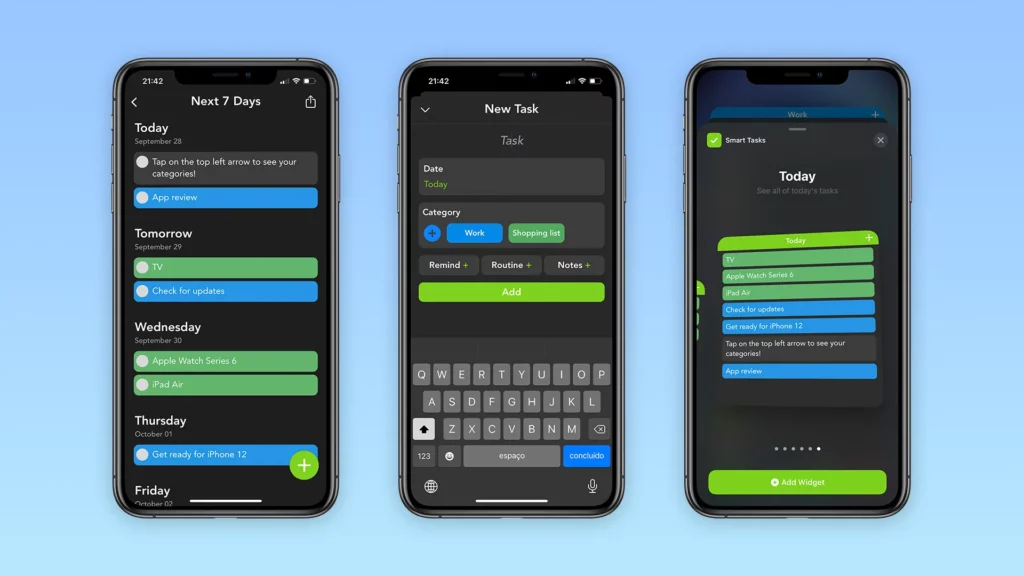
- Scaffold: Every Material Design app starts with the Scaffold widget. A floating action button, a navigation bar at the bottom, and a title bar are some of the frequent characteristics it offers.
AppBar: A Scaffold’s title bar is the AppBar widget. Title, leading icon, and trailing icon are all possible components.
- Bottom Navigation Bar: Displayed at the screen’s base is the BottomNavigationBar widget. The user can access other screens by tapping on the various tabs that it may include.
- Floating Action Button: You may see the FloatingActionButton widget in the lower right corner of your screen. A common example of an action it can execute is adding an item to a list.
How do I utilize Material App class in Flutter?
Importing MaterialApp into your project and launching it in the main function are required for using it. The app’s name that will appear in the title bar is its title property. The widget seen when the app first launches is the home property.
Conclusion
You can make beautiful and useful Material App class in Flutter Design apps with the help of the Material App class. Starting with MaterialApp is a great place to start if you’re new to Flutter. Scaffold, AppBar, Drawer, and all other Material widgets have been wrapped in it. You can use the MaterialApp widget to build an app that follows the Material Design Specifications.

